
Interaction Design
—
Art Direction
—
Custom Website
—
WordPress
—
Adobe Photoshop
—
Adobe XD
—
UX Design
—
HTML / CSS
—
Branding
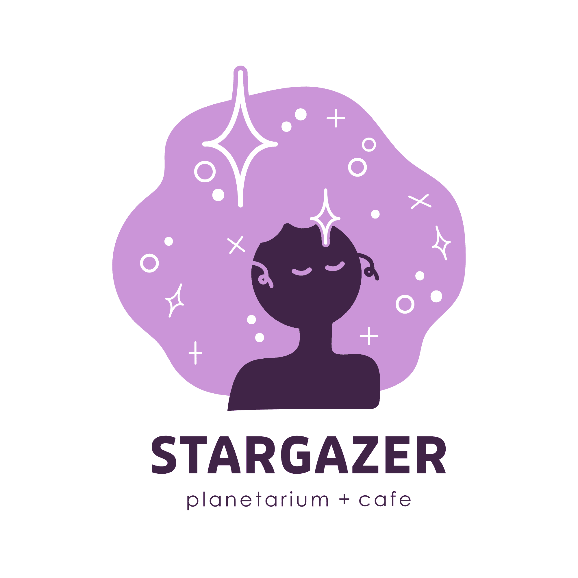
Stargazer Planetarium + Cafe | 2021
Reimagining the Nightlife Scene
Problem
In a city as vibrant as Chicago, there exists a quiet yearning for a convenient gathering place — a refuge for the insomniac, the introverted, the cozy night owl. The city needed something to do that wasn’t going to a bar or a show but offered the same sense of connection or entertainment. People need a place to sip coffee or tea, have a sweet treat, gaze at the stars, and share core memories with friends. Enter Stargazer Planetarium and Cafe. With a unique venue and a carefully devised menu, they were ready to welcome the community in with open doors. There was only one thing left they needed: a brand.

Tools
Adobe Illustrator
Adobe Photoshop
Adobe Indesign
Procreate
RawPixel
Tactics
Branding
Logo Design
Layout
Concepting
Discover
The goal for this project was to conceptualize and develop a comprehensive brand package that will comfort and inspire wanderlust for casual, nighttime city-goers.
Over the course of one month, I set out to build a full brand package: logo, color palette, typography, uniforms, menus, and more.
I must design for a diverse audience, mainly young adults who enjoy going out with friends but not partying. However, I also needed to consider the competing forms of nighttime entertainment to create an enticing brand that could promise a unique experience


Process
I began by gathering research and inspiration from a variety of influences — cafes, planetariums, speakeasies, coffee brands, etc. — to discover ways other brands were resonating with younger, more social audiences and began leaning towards modern and artistic interpretations for the basis of the planetarium cafe. Sketching out every idea possible, I discovered many logo and name variations. Many of these early concepts focused on celestial elements, incorporating light and shine to reflect a sense of wonder in an otherwise mundane night. After presenting various options to the client, Stargazer emerged as the perfect fit — a name that represents both the vastness of the night sky and the intimate feeling of personal discovery. I chose bold typography and soft, feminine color tones to break away from the typical darkness of night-themed brands, offering a refreshing, more inviting aesthetic.


Impact
Stargazer is now a bright brand that invites contemplation and connection, a beacon for Chicago’s quieter night owls.
While this was a conceptual project, it provided me with invaluable experience in the intricacies of brand development, reminding me that successful branding is not about personal taste but about connecting with the audience’s desires and the brand’s goals. Looking forward, I see great potential for expanding Stargazer’s reach, perhaps through the creation of a mobile app that could extend its dreams into the digital marketing world.

" height="10.898938293762207px" id="fAVnke0cX" transform="translate(0 0.093)" width="14.532px"/></svg>)
" height="14.531993400000001px" id="eQ5WmD4Dc" transform="translate(0 0.039)" width="14.532px"/></svg>)